Applications:
Website, hanging banners.
Timings:
1 day for 2 different logos, mood boards, colour palettes and basic visuals. Sole designer on project. Route 1 was chosen.
Route 1 – Mood board
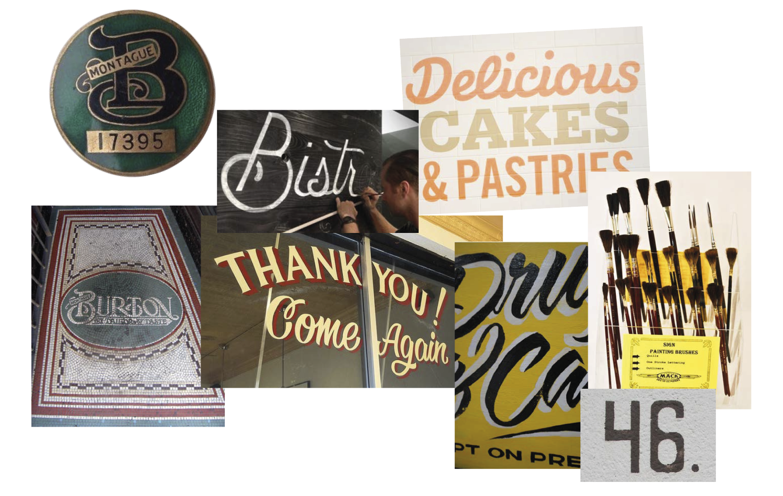
Building’s history (previously a Burton’s tailor shop and manufacture).
Bricks, current trend of specialist crafts such as sign painting and hand lettering.
––––––
Building’s history (previously a Burton’s tailor shop and manufacture).
Bricks, current trend of specialist crafts such as sign painting and hand lettering.
––––––

Route 1 – Logo
Thought process and inspiration:
Use the letter ‘B’ as a symbol and identifier, creating a nickname for the building.
Two keylines underneath the building name provide space for the location
of the development.
––––––
Thought process and inspiration:
Use the letter ‘B’ as a symbol and identifier, creating a nickname for the building.
Two keylines underneath the building name provide space for the location
of the development.
––––––

Route 1 – Colour palette, finishes & typography
Warm tones, sampled from bricks and plaster. Classic sans-serif typeface coupled
with a brush-like script.
––––––
Warm tones, sampled from bricks and plaster. Classic sans-serif typeface coupled
with a brush-like script.
––––––
Route 2 – Mood board
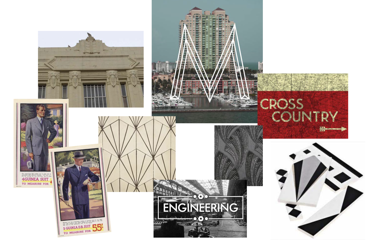
Building’s history and architectural details (previously a Burton’s tailor shop and manufacture).
Emphasis on the time the company was founded and the art deco movement in vogue then.
––––––
Building’s history and architectural details (previously a Burton’s tailor shop and manufacture).
Emphasis on the time the company was founded and the art deco movement in vogue then.
––––––

Route 2 – Logo
Thought process and inspiration: use the first name of Burton’s tailor founder, Montague, to name the development.
Usage of the word ‘apartment’ hints at high end accommodation.
The location of the development sits underneath the shaped logo sign.
––––––
Thought process and inspiration: use the first name of Burton’s tailor founder, Montague, to name the development.
Usage of the word ‘apartment’ hints at high end accommodation.
The location of the development sits underneath the shaped logo sign.
––––––

Route 2 – Colour palette, finishes & typography
Cooler tones, sampled from mosaic tiles present in the building, use of transparency and multiply effects.
Classic sans-serif typeface coupled with another sans-serif typically used in the 1930s.
––––––
Cooler tones, sampled from mosaic tiles present in the building, use of transparency and multiply effects.
Classic sans-serif typeface coupled with another sans-serif typically used in the 1930s.
––––––